
The Ultimate Design System for Modern Web Designers
Streamline Your Design Workflow with Time-Saving Efficiency
Used by designers and teams from
Power Up Your Design Process
Experience lightning-fast design with our powerful features that streamline your workflow and help bring your vision to life.
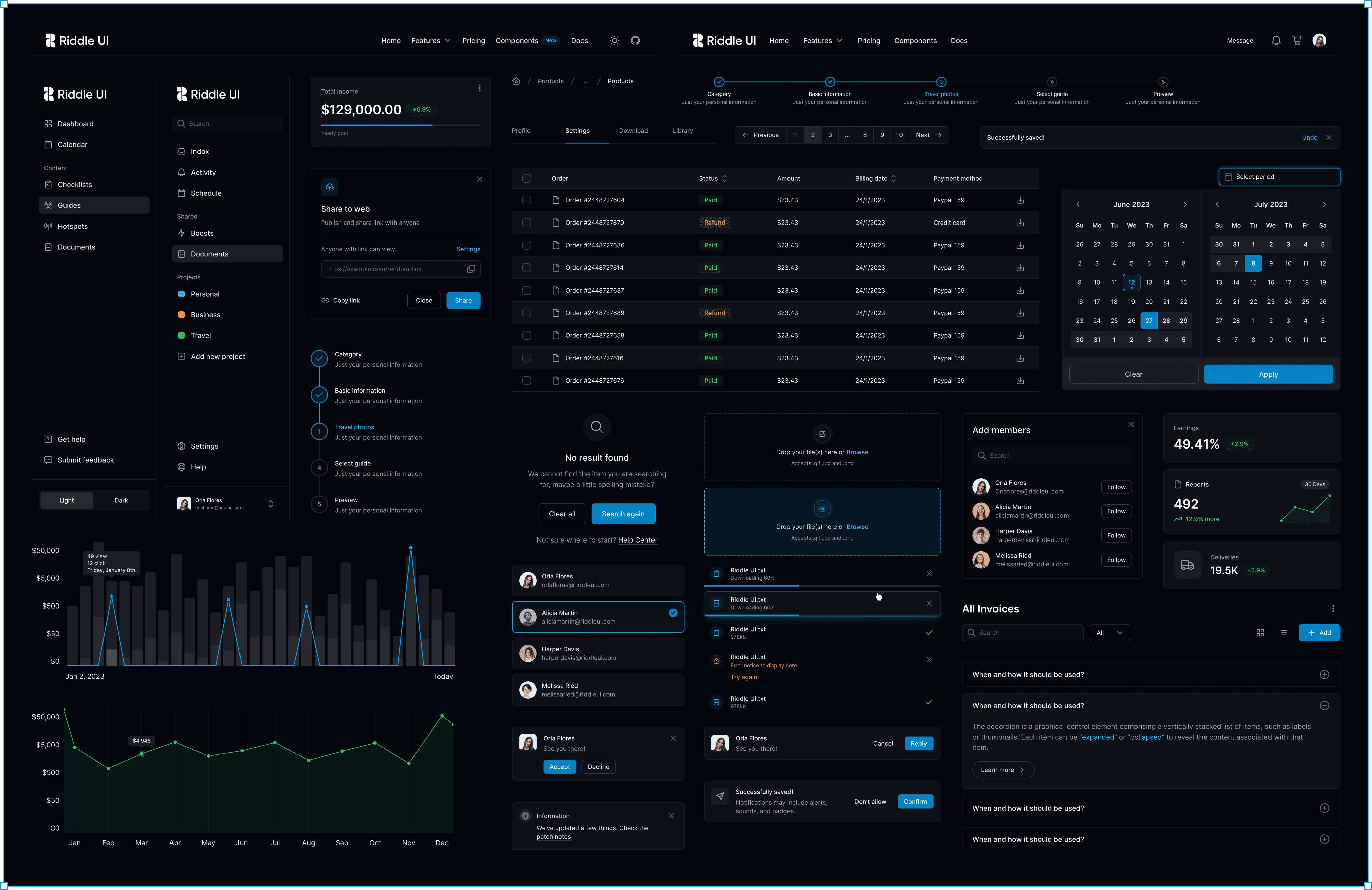
12K+ Components
Fuel your creativity with an expansive array of adaptable and dynamic design components.


Helpful text goes here
Tooltip text
A tooltip is a short text box that is linked to an element of your website. It provides contextual help to show the user what that particular element of your site does.
Light & Dark
Enhance user experience with Dark & Light mode.
Figma Variables
Variables in Figma empower you to create dynamic.
Typography
Transform your designs with stylish and expressive typography choices for captivating visual experiences.
Responsive
Create a seamless user experience with a responsive design that adapts to all devices.
Collaborate seamlessly and manage your projects with ease usingour all-in-one project management platform
Collaborate seamlessly and manage your projects with ease using our all-in-one project management platform
Empty state icons
Enhance user experience with delightful icons.
12k+
Total components
500+
Example sections
160+
Example pages
2,100+
Hand-drawn icons
Optimized for every type of skills
A Professional-Grade design system that adapts to every project's unique needs
Seamless Design Harmony
Unlock design harmony using Tokens that effortlessly synchronize colors, typography, and more.
| Token | Role | Light | Dark |
|---|---|---|---|
| Background-primary-base | Default page background | white | gray-900 |
| Layer-on-background-1 | Default page background | white | gray-800 |
| Text-color | Text color for button-tertiary | primary-700 | primary-400 |
| Text-helper | Tertiary text, Help text | gray-500 | gray-400 |
| Button-primary | Primary button background color | primary-500 | primary-500 |
Your design companion
Hone your skills with in-depth component documentation for precision.
Button types
Junior Designers
Learn the Building Blocks and Best Practices for Creating Stunning User Interfaces
Senior Designers
Say Goodbye to Repetitive Work and Headaches with a Streamlined UI Design System
Product managers
Get Straight to Your Goals with a Comprehensive UI System
Freelance designers
Automate Operations, Attract More Clients, and Deliver High-Quality Results
Developers & engineers
Code Faster and Smarter with Ready-to-Use Figma Templates
Startup
Accelerate Your Design with a Library of Customizable Templates
Choose Your Plan
We provide a very simple and transparent pricing model.
Starter
Get pro features and benefits with our single license user.
Professional
Get pro features and benefits with our Single license user.
Team
Unlock productivity with our Team plan for 6 users.
Unlimited
Large design teams. agencies, and enterprises with unlimited members.
Pay once, own it forever
Frequently asked question
Explore common queries about Riddle UI Design System and its benefits